Quick fix for Divi: Stretched featured image on a mobile screen
Quick fix for the image ratio of a blog post’s featured image on a mobile screen in the Divi theme. If you follow the guidelines and add a featured image to your post at the recommended size 960 x 440 pixels it looks good on your computer browser and on your mobile screen on your Smartphone. However, if you show all blog posts of a category (simply added on the WordPress menu settings) the images will be stretched and messes up with the image ration on your mobile screen.
Prerequisite
- Divi theme
- Blog post added to a category
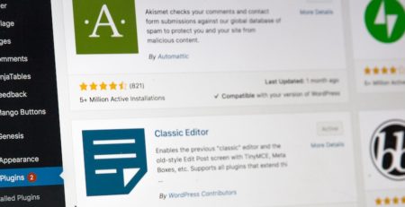
- Show all posts of category via the menu (like in the screenshot below)
- View on Smartphone / mobile screen

Result
The featured image of the post looks good on the computer screen but on the mobile screen, it will be stretched. This is only happening if you access the post overview of a category via added category menu, e.g. https://previous.markusraab.net/category/wordpress
If you create a page yourself with the Divi Visual Editor and add the blog module it will show the featured image in the right aspect ratio out of the box (assuming you followed the guidelines and used a 960 x 440 pixel featured image)

Stretched featured image on a mobile screen 
Fixed ratio on featured image on a mobile screen
Quick fix
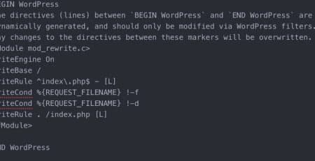
It most likely will be enough to just add this one CSS statement to your theme’s additional CSS or style.css of your child theme. Because of caching it could be that the fix does not work immediately, thus it helps to delete WordPress and Browser cache.
/* fix screen ratio in blog category overview as it was stretched image and not keeping the correct ratio on a mobile screen */
.et_pb_post a img {
    height: auto !important;
}
Untested further fixes related to featured image and aspect ratio
By default, the Divi Theme will stretch featured images to the width of the post area. If you’d like to disable this and have the images display at their actual size, you can do so by adding the following CSS to the theme:
body.single article.has-post-thumbnail > img:nth-of-type(1) {
   width:auto !important;
   height:auto !important;
}

body.single article.has-post-thumbnail .et_post_meta_wrapper > img:nth-of-type(1) {
   width:auto !important;
   height:auto !important;
}
Here’s the same code that additionally reduces the image to 70% instead of the original size and centers it on the desktop, while having it at 100% for mobile devices:
@media all and (min-width: 768px) {
body.single article.has-post-thumbnail > img:nth-of-type(1) {
   width:70% !important;
   height:auto !important;
   margin-left: auto;
   margin-right: auto;
   display: block;
}

body.single article.has-post-thumbnail .et_post_meta_wrapper > img:nth-of-type(1) {
   width:70% !important;
   height:auto !important;
   margin-left: auto;
   margin-right: auto;
   display: block;
}}